BRANDING
CRUMPLER REBRAND


GRAPHIC DESIGN | ART DIRECTION | PROJECT MANAGEMENT | PHOTOGRAPHY
THE BRIEF
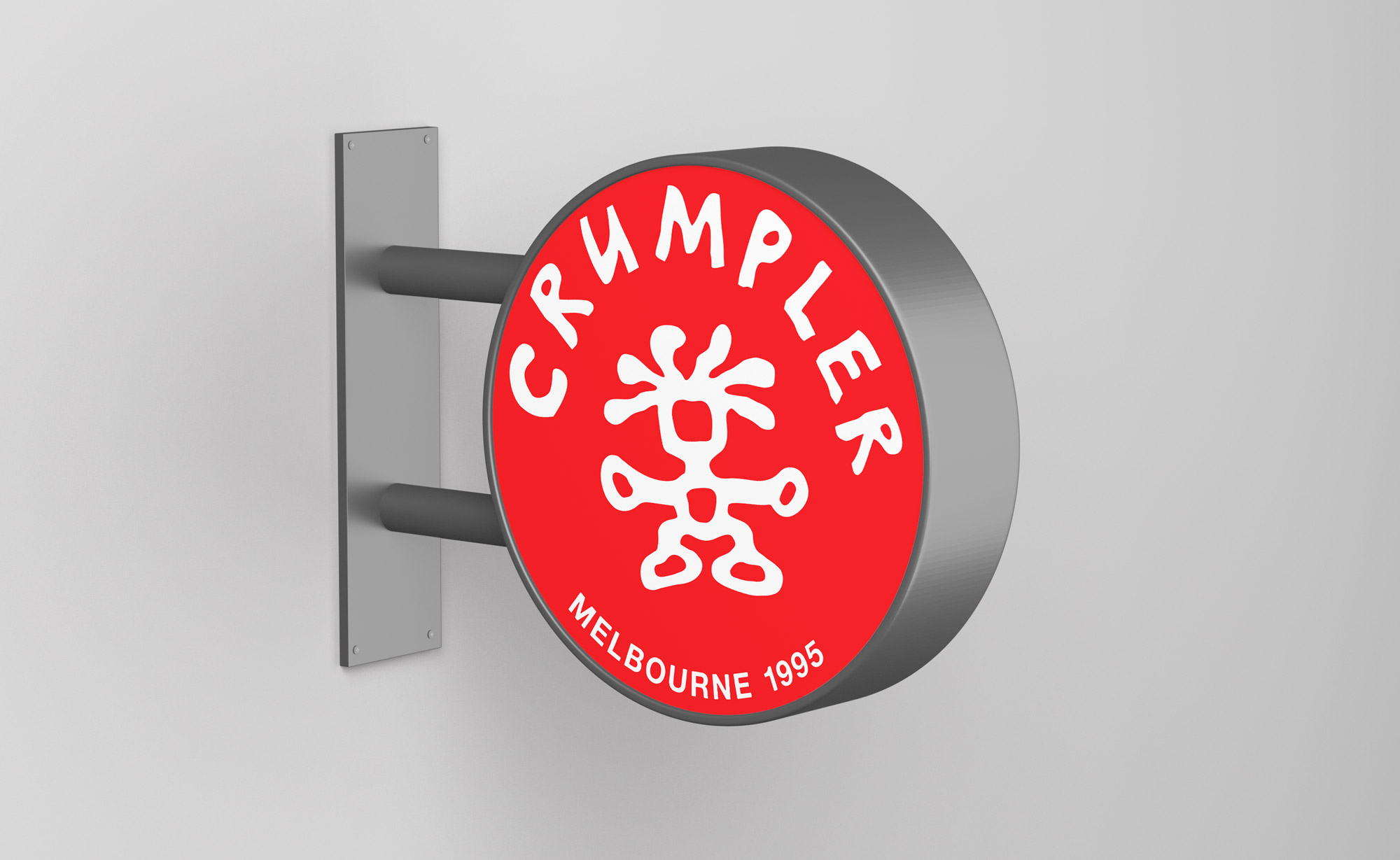
A new global strategy had been put in place to escalate growth within Asia (China being a priority growth market). Consumer research indicated that Crumpler’s OG circluar ‘cookie’ logo had been vastly more popular than their existing rectangle ‘ball and stick’ logo.
I was tasked to reimagine the classic logo (with a modern touch), develop new typographical treatments, a colour palette (previously mono) and a style guide – the end result being rolled out across all new product and new store designs, globally.
Part of this global rebrand was to develop supporting imagery that embodied Crumpler’s heritage, whilst staying inclusive to their current ‘tribe’. The result was a series of urban street posters and branded wallpaper, which I art directed, shot, and produced (except the ‘Crumpler Tribe’ image, which I directed the talented Lachlan Moore to shoot at Rockerby Studios in Melbourne). The creative was installed across all new stores, globally.


